Now With More Log Room
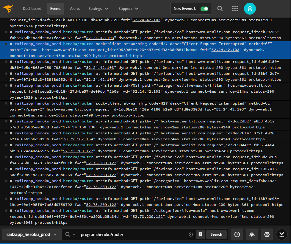
If you’ve visited the SolarWinds® Papertrail™ event viewer this week, you may have noticed it’s roomier. There’s less scrolling needed and more of the log line appears on the screen. You may be wondering what changed.
Based on suggestions from user feedback, we streamlined the navigation and tucked it into the top bar. This change lets the logs message fill the entire screen width and lets you see more of the log message, with less scrolling. Now you can sit back and enjoy more screen real estate for log searching fun.

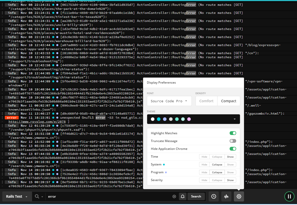
Of course, if you want even *more* room, you can also hide the application chrome from the display options menu and have every pixel to yourself.
Tri-state Display Options
Spotting issues in noisy logs full of multi-line event messages is hard. Sometimes you need all the details, including the time stamps, and system and program names to spot problems. Other times, you only need to see the text of the event messages. Now you don’t have to choose.
With tri-state display options, you decide what to show or hide, and whether to collapse or expand the event message. You can hide all the details until you have spotted the issue, and then expand out the details as you dig in to understand the systems and programs impacted.

You can also use the tri-state display options to customize what you copy, share, or send to other devices. What you see in the viewer is what is copied or shared. It’s perfect for sharing event data with other teams.

The tri-state options are in the display settings below the “hide the application chrome” option in the new Papertrail event viewer. These options apply to the Time, System, Program, and Severity fields. Try out the minimal navigation and tri-state options, and let us know what you think.