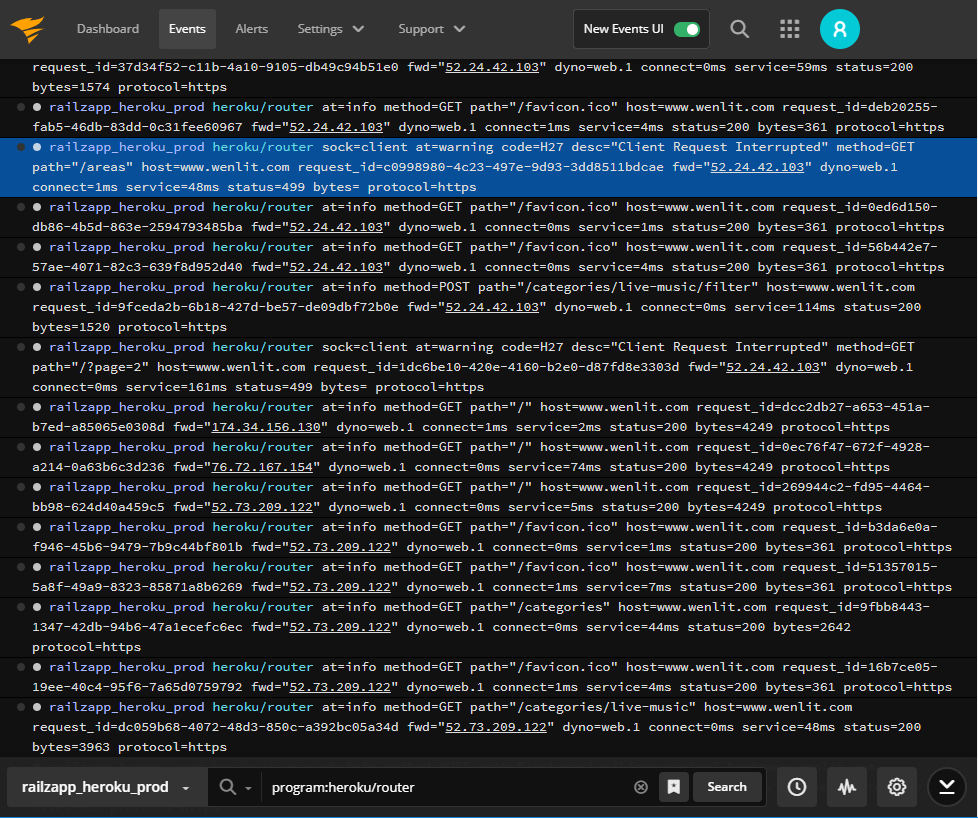
We’re pleased to release several improvements to Papertrail’s event viewer.
Based on our own experience and how we’ve seen customers use Papertrail, these changes make the viewer easier for new users to incrementally explore, then more predictable once you have.
- One place to choose what to see
- Quickly update existing saved searches
- Offer control of high-volume streams
- Moved Contrast setting to Profile
One place to choose what to see
There are three ways to control which logs the viewer shows: groups (of log
senders/systems), search queries, and time.
Until now, one of these options was buried in the upper left corner, hundreds of pixels away from the other two:

The idea was that the dropdown list of groups in the upper left corner would frame my view, in the same way that the title of a page might. The problem: the group of log senders is used alongside the search query and the time, which are both at the bottom of the screen. Also, so many sites use the upper left corner for site-wide navigation or decoration that Papertrail’s group dropdown was easy to miss.
Realizing this, we moved all three scope-constraining options to one place.
We hope this saves mouse mileage.
Bonus:
- the existing icon to access/change saved searches will glow blue when an existing saved search is being used
- edit any group or saved search right from the viewer:

Quickly update existing saved searches
Previously, to overwrite a saved search, one needed to navigate to the saved
search’s settings page and change the query in a form field. Usually I want to refine a saved search because I’m viewing the resulting logs, though. It’s
almost never a task of its own.
To avoid the back-and-forth, it’s now possible to update searches from the
event viewer. After searching for a query which isn’t currently saved, clicking “Save Search” now shows two options:

This new “Replace an existing search” option makes it easy for search queries to evolve and improve as I explore my logs, so saved searches always reflect the team’s current knowledge.
Offer control of high-volume streams
When “tailing” a live stream, sometimes the stream will include more new log messages than would be sane to present at once. I’m not great at evaluating 250 events per second, let alone 2,500 or 25,000, and having them unceremoniously dumped on my screen wouldn’t help me debug a problem.
This is only relevant for high volume live tail streams, so Papertrail showed
a subset of the new logs on the live stream and made all logs available for
non-live views.
However, this had two gaps: I want an indication that I’m viewing a subset of live logs, and I’d like more control of what to do next – sometimes I spot
a problem and do want to see more.
Now, when events are omitted from a high-volume live stream, Papertrail says so. Also, I can click to load omitted events:

Moved Contrast setting to Profile
Papertrail’s viewer supports a dark and a light background. Previously, this
was a button in the viewer. We’ve learned that contrast is more of a personal preference: once set, very few people want to change it casually, nor do we.
It wasn’t a good use of space or cognitive load in the viewer. It’s now in
Profile:

What do you think?
Our design goals are gradual, effortless discoverability the first time
something is needed, then minimum cognitive load on every future use. A recent 99% Invisible video about The Norman Door explains this incredibly well. Tiny decisions matter. In some cases, we’ve been testing these changes on ourselves and refining them for 2 months.
Take the updated viewer for a spin and send us your opinions and requests. Enjoy!
